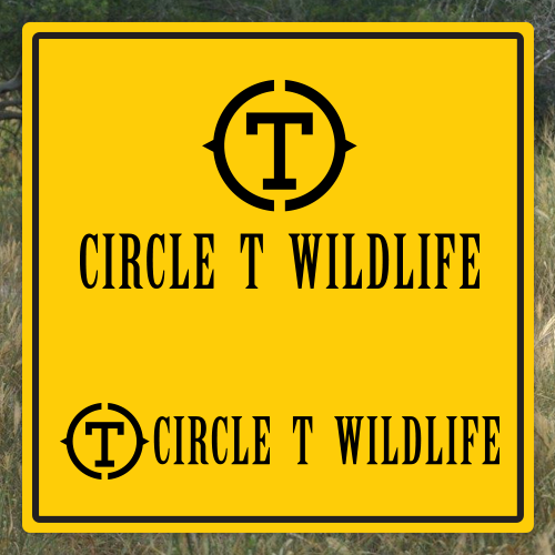
Circle T Wildlife

Project Description
Circle T. Wildlife needed their logo revamped. They wanted to keep the original layout but have a fresh look. Originally they wanted a font that was simple enough for the logo mark that we could also use for marketing purposes. The 'T' was created from scratch to give the look and feel needed.
Live Preview-
Skills:
- Design
-
Client:
Circle T Wildlife
