How To Create a Stellar Logo Design for Your Brand
Logo design always starts out with a great idea or concept. Besides having an eye for design, one must possess knowledge of vectors with a thorough understanding of whatever program you are using to create. This entry will point out very important things to keep in mind while developing your logo.
Brainstorming and planning are key with logo design: I’ve prepared these considerations for anyone ready to dive into the world of branding.
GREAT IDEAS
Envision your brand, first thing is first, get in front of a computer and research as much as you can. Take into consideration what exactly you want to convey and what needs to be emphasized. This can be accomplished by using proper subject matter, stylizing, weight, color, balance and shapes.
By visualizing your brand with enough planning and research, your end result will appear to fit and clearly communicate your goods or services. This is absolutely key when designing a successful logo and should always be in the back of your mind while conceptualizing your design. Once you have chosen your concept, grab some paper and prepare to sketch some logomark thumbnails. Always start with black and white to help ensure that your logo is legible, clear and reproducible without any distracting features. Next is to add some color, stylizing and subtle effects that will help make your design stand out.
REPRODUCIBILITY
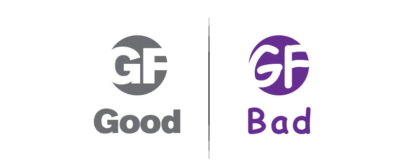
A logo’s versatility is very important, as that’s the main component of a company’s identity. This means it must be reproducible using a wide range of formats and processes while keeping its integrity. Logos are printed on pretty much anything small like business cards and pens to extremely large billboards and signs. Logos need to work well using traditional print methods like screen printing for apparel, as well as other things a consumer may want like stamps, stickers and embroidery. A logo must also look good on screen for use on websites and other RGB media. Its always a good idea to test your logo out on a screen set at 72dpi at an inch wide to see if any issues occur.
Things to watch for:
- How much detail do you need? Lots of small shapes and thin strokes should always be avoided
- White or negative space between shapes should be consistent and not too close together
- Gradients should be used gingerly but always creative and only when they enhance
- Getting carried away is always too easy when one has a need to want to be fun and interesting
COLOR PALETTE
Color creates emotion, it also creates persuasion and should never be underestimated. Cool, warm, neutral, vivid, complimentary, analogous, soft, light, dark, bright, saturated – all can be used effectively to enhance your message. The combination of these colors are equally important as they create balance, contrast and weight.
Choosing and experimenting with different color options and combinations is fun but must be taken very seriously. For example, it wouldn’t be a good choice to use red for a dentist office. Color logos that use a large range of CMYK colors can look really great but can also be very pricey and difficult to reproduce. Always consider keeping your logo to a couple of colors to keep cost down. Use tints of the colors when more levels are needed. Small color pallets can also work to keep logos from looking too cluttered.
SIMPLICITY?
Yes and no. YES, logo designs should be simple to effectively communicate an idea and to be easily reproduced. NO, they shouldn’t be limited to simplistic shapes. A logo has to work to differentiate it from its competition, so it’s always a good idea to add your own style to make your design unique. A little twist, shape or tapered line can make the design much more dynamic.
CHOOSING A TYPEFACE
Once your logomark has been designed and is up to par with your expectations, it is now time to choose what typeface you want to use for the logotype part of your design. This means choosing something that will complement the shapes, lines and style of your logo. Try not to choose anything too whimsical, funky or illustrative. Fonts like this are fun but can seriously compromise the legibility and seriousness of your logo and your brand.
With that said, I hope these tips give you something to keep in mind as you design your logo. Happy designing!
Comments (0)